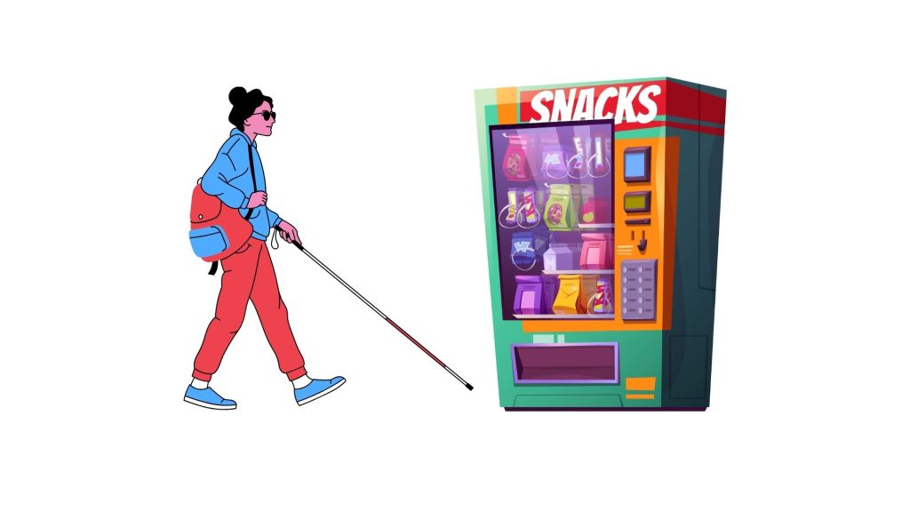
1️⃣ My understanding of a vending machine
“Before jumping into the redesign, let me quickly outline how a typical vending machine works today.
A vending machine is a self-service device that dispenses products like snacks or beverages after the user selects an item and makes a payment.”
“Does that sound right to you before I move ahead?”
2️⃣ Clarifying Questions
“Before jumping into the solution, I’d like to clarify a few things to ensure I’m designing in the right context.”
- Are we redesigning an existing vending machine or building a new one from scratch?
→ Assumption: We’re designing a new machine, so we have flexibility in both hardware and software. - What type of visual impairment are we targeting — partial, color-blindness, or full blindness?
→ Assumption: The goal is to design for users who are completely blind, ensuring full accessibility without relying on visual cues. - Where will this vending machine typically be placed? (e.g., metro stations, office lobbies, airports, schools)
→ Assumption: The machine will be placed in public indoor spaces like offices, stations, and hospitals — moderately noisy but not outdoor-exposed. - What kind of products will it dispense? (Snacks, beverages, or mixed items)
→ Assumption: It will mainly sell snacks and beverages, which have simple packaging and easy physical recognition. - What payment modes should we support? (Cash, card, UPI, NFC, voice-enabled wallets)
→ Assumption: Focus on cashless payments — cards, UPI, and NFC — since these are easier for blind users than handling cash. - Are there any cost or size constraints?
→ Assumption: We have standard vending machine dimensions and moderate cost flexibility; focus is on usability rather than extreme cost-cutting. - Do we assume the machine will have network connectivity?
→ Assumption: Yes, the machine is IoT-connected, enabling digital payments, audio prompts, and software updates.
“Do these assumptions and clarifications sound good before I move ahead
Re – Define the Problem Statement:
Design a new vending machine for fully blind users, placed in indoor public environments like offices, hospitals, or metro stations, primarily selling snacks and beverages, with cashless (UPI, card, NFC) payment options.
3️⃣ Define the Ecosystem Players
“Before going ahead, I’d like to map out the key players in the vending machine ecosystem — both users and stakeholders — to ensure I’m designing for everyone impacted.”
1. Primary User:
- Blind or visually impaired customer (fully blind)
- Needs to independently locate, select, pay for, and collect products.
- Relies on tactile, auditory, and voice-based feedback.
2. Secondary Users:
- Sighted users — may occasionally use the same machine (so it should still be intuitive for them).
- Partially blind users — may benefit from the same accessibility enhancements.
3. Business Stakeholders:
- Vending Machine Operator / Company:
- Owns and maintains the machine, monitors inventory, and collects payments.
- Product Suppliers / Brands:
- Provide snacks and beverages; may want visibility or branding within the machine.
- Payment Partners:
- Handle card, UPI, and NFC transactions; responsible for secure, accessible payment flows.
- Facility Owner / Location Partner:
- Provides space, power, and internet connectivity (e.g., hospital, metro station, office).
4. Support & Compliance Stakeholders:
- Accessibility Regulators or Standards Bodies (e.g., ADA / BIS)
- Ensure the design complies with accessibility norms and safety standards.
- Maintenance Technicians
- Need an easy way to refill, repair, and update the machine with minimal downtime.
So, while the primary design focus is on the blind user’s end-to-end experience, we must ensure the design remains operationally feasible and commercially sustainable for all these players.
“Does that ecosystem mapping look comprehensive before I move to identifying user pain points?”
4️⃣ Identify User Pain Points
“To design effectively, it’s important to understand the challenges a fully blind user faces at each stage of interaction with a typical vending machine.”
🧭 User Journey & Pain Points
1. Discovering the Machine
- No way to know the machine exists nearby.
- No audio or tactile indication of its location.
- Hard to identify it safely in crowded or noisy public spaces.
2. Exploring Available Items
- Product information (name, type, price) is entirely visual.
- No tactile or audio way to know what’s being sold.
- Cannot verify stock availability or item categories.
3. Selecting an Item
- Buttons and touchscreens have no tactile distinction.
- Item codes (A1, B2) have no accessible mapping.
- Easy to make selection errors with no confirmation feedback.
4. Making Payment
- Payment slots or card readers are hard to locate by touch.
- No feedback on whether payment has started, succeeded, or failed.
- Digital payments rely on visual confirmation from screens.
- Fear of incorrect or double charges due to lack of confirmation.
5. Collecting the Product
- Collection tray is difficult to find.
- No clear indication that the product has been dispensed.
- Risk of the item getting stuck or misplaced without the user realizing.
6. Post-Purchase Feedback / Confirmation
- No way to verify which product was dispensed.
- No accessible receipt or confirmation of purchase.
- No feedback loop if something goes wrong (e.g., refund or issue reporting).
In short, the main pain areas revolve around discovery, information access, interaction clarity, and transaction trust — each step involves uncertainty or dependency on others.
5️⃣ Step 5 — Proposed Solutions
1. Machine Discovery — Tactile Floors
Tactile floor indicators guide blind users safely and independently to the vending machine. These raised, patterned surfaces can be felt underfoot or with a cane, forming a path from entrances or key points directly to the machine. The patterns indicate direction changes or proximity, allowing users to navigate even in noisy or crowded environments without relying on sight.
2. Exploring Available Items — Braille Labels and Audio Display
All items and corresponding buttons are labeled in Braille so blind users can identify products through touch. An audio display provides item names, prices, and brief descriptions through built-in speakers or a personal device connection. Optional tactile indicators for item categories and NFC-enabled personalized audio feedback further support independent browsing and informed selection.
3. Selecting an Item — Tactile Buttons and Voice Confirmation
Selection buttons are tactilely distinct and labeled in Braille, enabling users to locate and identify the correct choice by touch. Once an item is selected, the machine provides immediate voice confirmation, including the item name and price, with the option to cancel or change the selection before payment. Sequential audio navigation can help users browse items systematically and reduce errors.
4. Making Payment — Card Slots with Tactile Markers and Audio Feedback
Payment is completed using cards only, with the slot clearly marked using tactile indicators to help users locate it. Audio prompts guide the user through each step, indicating when the card is inserted, when the payment is processed, and whether it is successful or if an error occurs, ensuring secure and independent transactions.
5. Collecting the Product — Haptic Feedback Tray
The vending machine features a tray that provides haptic feedback when a product is dispensed. When the item lands, the tray vibrates slightly, allowing the blind user to sense the arrival of their product through touch.
6. Post-Purchase Confirmation — Audio Receipt and Support
After the purchase, the machine provides an audio confirmation detailing the item dispensed and the payment completed. Audio instructions guide the user in case of errors, and connectivity to a helpline or support service is available for additional assistance, ensuring the user has clear feedback and support throughout the transaction.
6️⃣ Step 6 — Feature Prioritization
To ensure maximum accessibility and independence, I’ve prioritized the features based on impact on the user journey and implementation effort.
🟢 Must-Have (High Impact, Low/Medium Effort)
These features are essential for enabling a complete, independent purchase flow for blind users.
- Tactile Floors (Machine Discovery) — Enables users to locate the vending machine without assistance.
- Braille Labels and Audio Display (Exploring Items) — Allows users to understand what products are available.
- Tactile Buttons and Voice Confirmation (Selecting Item) — Ensures users can confidently make selections.
- Card Slots with Tactile Markers and Audio Feedback (Payment) — Critical for completing payments securely and independently.
🟡 Should-Have (High Impact, High Effort)
These enhance confidence and usability but can come after the MVP.
- Haptic Feedback Tray (Collecting Product) — Improves independence through tactile cues but needs mechanical redesign.
🔵 Nice-to-Have (Medium Impact, Medium/High Effort)
Adds reassurance and support but not essential for the core flow.
- Audio Receipt and Support (Post-Purchase Confirmation) — Provides clarity and assistance but isn’t a blocker for usability.
✅ MVP Recommendation
The MVP should include Tactile Floors, Braille & Audio Display, Tactile Buttons with Voice Confirmation, and Card Payment with Audio Feedback, ensuring a blind user can discover, explore, select, and pay — all independently.
7️⃣ Success Metrics
- Independent Usage Rate
→ % of blind users who can complete the full purchase flow (discovery → selection → payment → collection) without external assistance.
(Target: ≥90% after pilot testing) - Task Completion Time
→ Average time taken by a blind user to complete a transaction compared to a sighted user.
(Target: ≤1.5x of regular user time) - Error Rate per Transaction
→ Number of failed or incorrect item selections, payment errors, or collection issues.
(Target: <5% after first iteration) - User Satisfaction / Accessibility Score
→ Collected through post-use audio surveys or accessibility feedback.
(Target: ≥4/5 satisfaction rating)
8️⃣ Trade-offs
While designing this vending machine for blind users, several trade-offs would need to be considered between accessibility, cost, scalability, and usability:
⚙️ Accessibility vs Cost of Implementation
Adding tactile floors, haptic trays, and audio systems increases accessibility but also raises manufacturing and installation costs.
Trade-off: We may prioritize core accessibility elements (tactile + audio + payment) for the MVP, while deferring higher-cost features like haptic feedback trays until later phases.
🛠️ Physical Durability vs Tactile Sensitivity
Tactile buttons and Braille labels may wear out faster in high-traffic areas.
Trade-off: Use durable, replaceable tactile panels or metallic embossing to maintain longevity without losing tactile clarity.
💳 Payment Security vs Ease of Use
Simplifying card payments with audio guidance helps usability, but detailed voice prompts could expose sensitive financial information.
Trade-off: Keep audio feedback generic (“Payment successful”) without reading sensitive data aloud.
9️⃣ Summary
This case focused on redesigning a vending machine to make it fully accessible for blind users. After understanding how traditional machines work and clarifying assumptions, the problem was reframed around enabling independent discovery, selection, payment, and collection. The proposed solutions combined tactile, audio, and haptic feedback — such as tactile floors for navigation, Braille and audio interfaces for exploration, tactile buttons with voice confirmation for selection, and tactile card slots for payment.
Features were prioritized to balance accessibility with feasibility, ensuring the MVP delivers a complete, independent experience. Success will be measured through user independence, task completion time, error rate, and satisfaction. Overall, the design promotes autonomy, inclusivity, and trust for blind users, while staying feasible for businesses to implement.

Leave a comment